
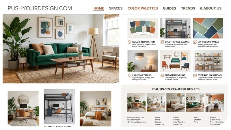
tisDesign is moving beyond perfectly polished visuals. PushYourDesign is a place to explore fresh creative directions, practical design ideas, and visual inspiration that fit the way people create in 2026. From tactile textures and expressive typography to surreal imagery and AI-assisted workflows, PushYourDesign can help creators turn a basic idea into something more personal and memorable.
The biggest shift this year is not about following one specific style. It is about combining technology with human taste. Canva’s 2026 trends report points toward imperfect, tactile, playful, and more human visual work, while Adobe’s creative forecast highlights sensory design, cultural connection, surreal visuals, and experimentation.
What Is PushYourDesign?
PushYourDesign represents a creative approach built around discovering ideas and turning them into useful visual work. It can apply to graphic design, branding, websites, social media graphics, digital art, presentations, interiors, illustrations, and other creative projects.
The goal is not to make every project look the same. Instead, good design should communicate an idea clearly while giving the audience a reason to stop, look, and remember it.
For beginners, that might mean learning how to combine fonts or choose a better color palette. For experienced creators, it could mean experimenting with unusual layouts, motion, AI-generated concepts, or mixed-media techniques.
The most useful inspiration is the kind that leads to action. Rather than saving hundreds of attractive images without creating anything, use references to understand why a design works and how you could adapt the underlying idea.
PushYourDesign Trends Shaping Creative Work in 2026
Several visual directions are becoming especially noticeable in 2026. They are not strict rules, but they offer useful starting points for anyone looking for fresh design inspiration.
1. Imperfect and Human-Looking Design
Perfectly polished graphics are no longer the only way to communicate professionalism. Designers are increasingly using hand-drawn marks, rough edges, natural textures, handwritten elements, and slightly unexpected layouts.
Canva describes 2026 as the “Year of Imperfect by Design,” highlighting a move toward visuals that feel raw, personal, and less controlled.
This approach can work particularly well for:
- Personal brands
- Creative portfolios
- Lifestyle websites
- Independent businesses
- Social media campaigns
- Editorial content
The key is intentional imperfection. A rough texture should support the concept rather than make the design look unfinished.
2. Tactile Textures
Flat digital surfaces are getting more competition from designs that suggest physical materials.
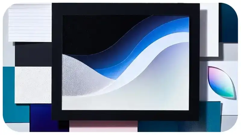
Think glass, paper, fabric, wax, grain, brushed surfaces, soft shadows, and layered materials. These elements can make a digital composition feel more dimensional.
Canva’s 2026 research identifies tactile design as a major direction, while Adobe also points toward sensory-driven visual experiences.
You do not need to cover an entire design with texture. A textured background, product detail, card, or headline can be enough.
3. Expressive Typography
Typography is becoming more than a tool for presenting information. Large, unusual, playful, and highly expressive lettering can become the central visual element.
Adobe’s 2026 graphic design forecast includes exaggerated and playful letters among its major trends.
Try experimenting with:
- Oversized headlines
- Mixed font weights
- Distorted letters
- Unusual spacing
- Curved text
- Handwritten accents
- Serif and sans-serif combinations
Good typography still needs to be readable. Creativity should support communication, not replace it.
4. Surreal and Unexpected Visuals
Surreal imagery gives designers a way to create visuals that feel unfamiliar.
A normal photograph might be combined with an impossible object, unusual proportions, distorted architecture, floating elements, or dreamlike lighting. Adobe identifies surreal and absurdist imagery as one of its 2026 design directions.
AI tools have made this type of experimentation easier, but the strongest results still require human editing. Generate several concepts, select the useful parts, and refine the final composition instead of publishing the first output.
5. Editorial and Storytelling Layouts
Not every design needs to look like a traditional social media template.
Editorial layouts use hierarchy, whitespace, columns, typography, photography, and pacing to guide the viewer through information. Canva’s 2026 trends include Explorecore, which emphasizes layered storytelling, simple layouts, and purposeful exploration.
This approach works especially well for:
- Blogs
- Magazines
- Portfolio websites
- Brand stories
- Travel content
- Product guides
- Long-form social posts
Think of the page as a story rather than a collection of separate design elements.
AI and the New Creative Workflow
For this is now part of many creative workflows, but using it well requires more than entering a prompt and accepting the result.
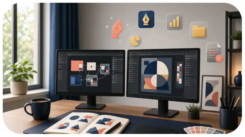
AI can help with brainstorming, moodboards, image concepts, variations, background ideas, copy suggestions, and early visual exploration. Adobe and Canva both describe AI as an increasingly important part of the creative process while also emphasizing human creativity and judgment.
A practical workflow looks like this:
- Start with the idea. Define the audience, purpose, mood, and message.
- Collect references. Look for visual patterns instead of copying individual designs.
- Use AI for exploration. Generate multiple directions rather than one final answer.
- Choose a strong concept. Remove ideas that do not support the message.
- Add human judgment. Adjust composition, typography, color, spacing, and details.
- Check the final design. Make sure it is readable, consistent, and appropriate for its audience.
The human role becomes even more important when AI makes visual production faster. The tool can generate possibilities, but the creator decides which possibility deserves attention.
How to Find Better Design Inspiration
Good inspiration is not simply about finding attractive images. It is about learning how visual decisions create an effect.
When you discover a design you like, ask:
- What caught my attention first?
- How does the designer use contrast?
- Why does the typography work?
- Where does my eye move next?
- Is the color supporting the message?
- What emotion does the design create?
- Could the same principle work in another project?
For example, you might see a poster with an oversized headline and almost no imagery. Instead of copying the poster, study its hierarchy. You may realize that the large type creates focus and makes the message easier to remember.
That lesson can then influence a website hero section, Instagram graphic, presentation cover, or product advertisement.
Color Trends: Use Emotion Before Fashion
Color trends can provide inspiration, but choosing a palette only because it is fashionable can create weak results.
Start with the emotion and personality you want to communicate.
A calm wellness brand may benefit from softer tones and natural combinations. A youth-focused campaign may use stronger contrast and energetic colors. A luxury concept might rely on restrained combinations with carefully chosen accents.
In 2026, designers are also exploring richer, more expressive visuals alongside quieter, structured layouts. Canva’s trends include both dramatic visual styles and an “Opt-Out Era” focused on simpler, more structured design.
This contrast is useful because there is no single “correct” modern palette.
Designing for Social Media
Social platforms reward designs that communicate quickly.
A strong social graphic should make its main idea clear within seconds. That does not mean every post needs enormous text or bright colors. It means the hierarchy should be obvious.
Try this structure:
Primary message → supporting visual → useful detail → action
For example, a design tip post could use a short headline as the main element, followed by a simple example and one practical recommendation.
For video content, movement can add another layer. A headline can enter the frame, an image can change gradually, or small details can create visual rhythm.
The best motion usually has a purpose. If every element moves at once, the viewer may struggle to understand what matters.
PushYourDesign Ideas for Websites and Branding
A website should balance personality with usability.
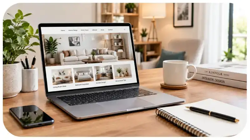
Current design experimentation may include bold typography, layered imagery, tactile effects, editorial grids, subtle animation, and distinctive illustrations. However, the basics still matter: readable text, clear navigation, responsive layouts, fast-loading pages, and strong visual hierarchy.
For branding, consistency is even more important.
A useful brand system should define elements such as:
- Primary and secondary colors
- Typography
- Logo usage
- Image style
- Icon style
- Spacing rules
- Tone of visual communication
You can experiment with trends without rebuilding the entire identity every few months. A timeless foundation makes it easier to introduce new creative elements without losing recognition.
How Beginners Can Start Creating in 2026
You do not need expensive equipment or advanced software to improve your design skills.
Start with one small project. Create a social media post, redesign a fictional landing page, make a poster, or build a simple moodboard.
Then create three versions:
- Minimal: Use fewer elements and more whitespace.
- Expressive: Increase typography, texture, and visual contrast.
- Experimental: Try unusual composition, surreal imagery, or mixed-media elements.
Compare the three versions and ask which one communicates the idea most clearly.
This exercise teaches more than endlessly watching tutorials because you are making actual design decisions.
Common Design Mistakes to Avoid
Following trends can become counterproductive when the trend becomes more important than the message.
Avoid these common problems:
1. Too many visual effects
Gradients, shadows, textures, animations, and 3D elements can compete for attention. Give each effect a reason to exist.
2. Poor typography
A fashionable font cannot fix weak hierarchy. Make sure headings, body text, captions, and buttons have clear relationships.
3. Copying trends too closely
A design can look modern while still feeling generic. Add a recognizable point of view through imagery, language, composition, or brand details.
4. Ignoring accessibility
Small text, weak contrast, and complicated layouts can make content difficult to use. Design for real people, not just screenshots.
5. Treating AI output as finished work
AI-generated concepts often need editing. Check details, consistency, typography, anatomy, composition, and brand fit before publishing.
Where Creative Design Is Heading Next
The most interesting part of 2026 is the combination of seemingly opposite ideas.
Design can be high-tech and handmade. It can use AI while still showing human personality. It can be dramatic or quiet, minimal or maximal, digital or tactile.
Canva’s research highlights trends such as Reality Warp, Prompt Playground, Texture Check, Notes App Chic, and Drama Club, while Adobe highlights sensory experiences, playful experimentation, surreal imagery, cultural authenticity, and human connection.
That variety suggests creators have more room to develop distinctive visual identities instead of following one universal style.
How to Turn Inspiration Into Original Work
The best way to use design trends is to treat them as ingredients rather than instructions.
Suppose you like tactile textures, oversized typography, and vintage photography. You could combine those three ideas into a completely new visual system for a coffee brand, magazine cover, or creative portfolio.
The goal is not to reproduce the reference. The goal is to understand the design principle and apply it to a different problem.
Keep a small inspiration library and organize it by useful categories such as typography, color, layout, photography, texture, motion, and branding. Over time, you will start recognizing patterns and developing your own visual preferences.
Conclusion
The strongest creative work in 2026 is not necessarily the most complicated. It is work that has a clear idea, a recognizable point of view, and enough visual personality to connect with its audience.
PushYourDesign can be approached as a mindset: explore new styles, study why they work, experiment with modern tools, and then add your own creative judgment. Trends can provide the starting point, but original thinking is what turns inspiration into memorable design.

Leave a Reply